1. Introduction: Why Most FlutterFlow Apps Don’t Look Professional
Most apps don't look unprofessional because of FlutterFlow—they look that way because core design principles are overlooked. Issues like inconsistent spacing, poor color choices, and cluttered layouts are design problems, not technical ones.
FlutterFlow already provides the tools needed to create polished interfaces. The key lies in how you structure, refine, and maintain your designs. In this guide, we'll focus on practical strategies that genuinely improve UI quality and help make your FlutterFlow app look professional without adding unnecessary complexity.
2. How Should You Structure UI in FlutterFlow?
Most people jump straight to colors and fonts. That’s where things go wrong.
Start with structure. Break your screen into clear sections, header, content, actions. Group related elements together. Keep spacing predictable. When the structure is clean, the UI already feels organized even without styling.
Think in terms of hierarchy. What should the user notice first? What comes next? If everything looks equally important, nothing stands out.
A simple way to approach this:
- Define sections before adding design
- Keep layouts consistent across screens
- Avoid stacking too many elements in one place
This is where a solid FlutterFlow design guide mindset helps. Once the structure is right, styling becomes easy. If it’s wrong, no amount of colors will fix it.

3. The Core UI System: Spacing, Alignment, and Consistency
If structure is the skeleton, spacing and alignment are what make it look clean.
Most messy UIs come from uneven spacing. Elements sit too close, too far, or randomly placed. Fixing this alone can dramatically improve how your app feels.
Start simple:
- Use consistent padding across screens
- Align elements to a grid (don’t eyeball it)
- Keep equal spacing between similar components
Consistency matters just as much. Buttons, cards, and text blocks should follow the same patterns everywhere. When things behave predictably, the UI feels intentional.
These are basic mobile app UI design tips, but they’re often ignored. Strong FlutterFlow UI best practices aren’t about adding more, they’re about making everything uniform.
Once spacing and alignment are clean, the app instantly looks more refined without any extra effort.
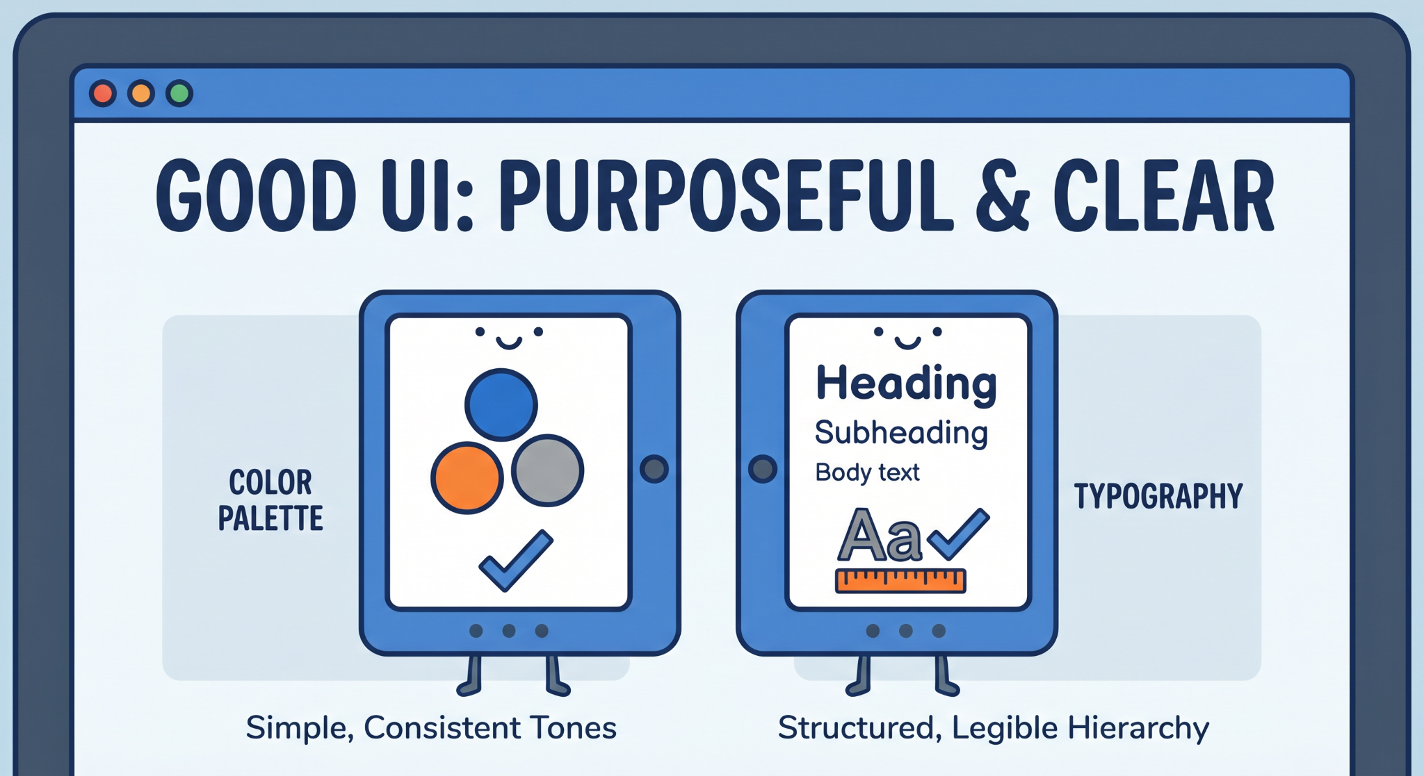
4. How Do You Choose Colors and Typography?
Good UI doesn’t use more colors. It uses fewer, on purpose.
Start with a simple palette: one primary color, one secondary, and a few neutral tones. That’s enough. Random colors across screens make the UI feel inconsistent and hard to follow.
Contrast matters more than variety. Text should always be easy to read against the background. If users have to strain, the design is already failing.
Typography follows the same rule: keep it structured.
- Use 2–3 font sizes consistently
- Define clear hierarchy (heading, subheading, body)
- Avoid mixing too many styles
You don’t need fancy fonts. You need clarity. When colors and typography are controlled, the UI starts feeling deliberate instead of improvised.
5. From UI to Experience: What Makes an App Feel Professional?
A layout can look neat and still feel clunky. That’s usually a flow issue.
Try using your own app without thinking like a builder. Just tap through it. If you hesitate, even briefly, something isn’t clear. Good design removes that friction. You shouldn’t need instructions to move forward.
Navigation should guide the user naturally. One action should lead to the next without confusion. If users have to guess, the experience breaks.
Then look at how the app behaves. Rotate the screen, try different devices. If elements shift awkwardly or feel cramped, it shows.
A few small adjustments help a lot:
- Buttons should clearly react when tapped
- Transitions shouldn’t feel abrupt
- Anything unnecessary should be removed
These FlutterFlow app design tips aren’t flashy, but they’re effective. This is how you make FlutterFlow app look professional, by fixing how it feels, not just how it looks.
6. Conclusion
A good UI isn’t about doing more, it’s about doing the right things consistently.
Most apps feel unpolished because the basics are off. Not because of missing features, but because structure, spacing, and clarity weren’t handled properly. Fix those, and the difference is immediate.
That’s where FlutterFlow UI design really matters. The tool already gives you flexibility. What changes the outcome is how intentionally you use it.
If you apply these fundamentals, you don’t need complex tricks. You naturally make FlutterFlow app look professional, just by making better decisions at each step.
%20(1).jpg)

View more blogs
.png)
.png)
%20(1).jpg)


.png)

.png)
.png)
Ready to develop your own product? Get in touch today!
Get in Touch